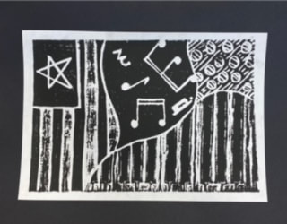
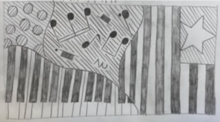
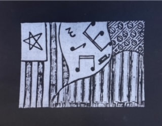
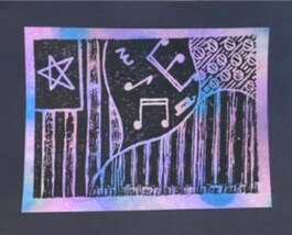
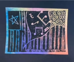
The plan that I had for this print was to add a little bit about me into it. I like piano, and music because that's what I grew up around as a kid. My print shows something about me because I like playing the piano, music, and the American flag is a part of my culture. The main thing that I really focused on was adding color to my prints by making a colored background and I also had to focus on the value to make sure that the right spots were pushed down on the foam piece. One challenge that I did face was making everything on my foam piece backwards, because it has to be backwards on the foam piece to be able to show up normally like it did on my final print. The one thing that I would change to make it look a little bit better would be to push down the tiles for the piano a little more so the ink doesn't show through it as much. Otherwise, I still like how it turned out. My favorite thing about my print would probably be the flag and the music notes, because they showed up the best with the ink and I just like how they turned out.
0 Comments
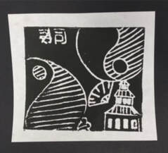
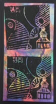
One thing that I liked about my idea was the writing, because sushi is one of my favorite foods and I was able to put it on my design. Two things that I learned from doing this printing was learning how to add enough ink to make the print look good, and also learning how to do the printing in general because it was something some what new that I learned.
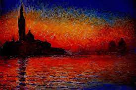
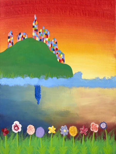 The famous painting that I am imitating is "Venice at Sunset" by Claude Monet. I chose this painting because I've always liked the way that sunsets look so calm and colorful. The main thing that I used as a unique idea to change this painting up a little bit was I added a little bit more color to make it stand out a little more. I added flowers at the bottom by the water, added grass and color to the hill, water splashing against the hill for a different effect, and I made the buildings more colorful like flowers to match with the bottom and to make the painting stand out. One of the hardest parts in making this art work was definitely making the reflection of the sunset in the water because I had never done that before, so it was kind of fun to experiment with that. Something I am proud of again would be the reflecting water, because I had never done art like that before and I like how it turned out in the end. For this artwork I am going to name it "Flowers at Sunset", because I added the flowers, and flowers and sunsets both relate in color.
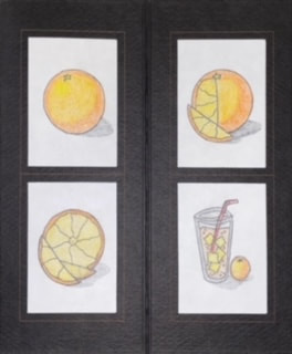
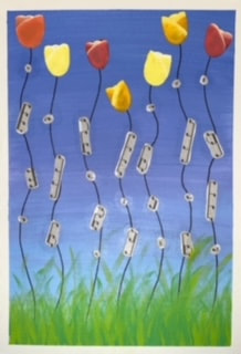
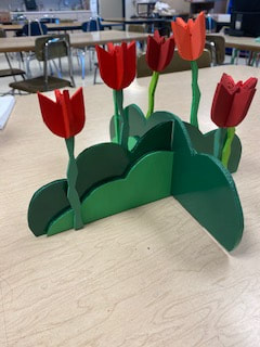
The transformation piece that I enjoyed the most would be the one with the orange. I like that one the most because I like how each picture all pieces together and just works well together overall.The artist that inspired me the most was the Rob Gonsalves, because I like how his paintings and other art pieces are more realistic and very creative. But I also like how they are both realistic and almost so creative that they couldn't possibly be real in reality. This artist inspired me because I like how he could put something in a painting that looks realistic or like it almost belongs in the painting. I would say that my favorite part of my final project would be the tulips at the top of the painting, because I have never painted tulips before and I really like how they turned out. One challenge that I did have was painting the tulips, because I had line the colors up the right way so that I could make it look more realistic. One way that I showed creativity in my project would be with the music notes, because I used the stems of the tulips as a staff and then I glued the music notes on them to make that idea really pop out more. 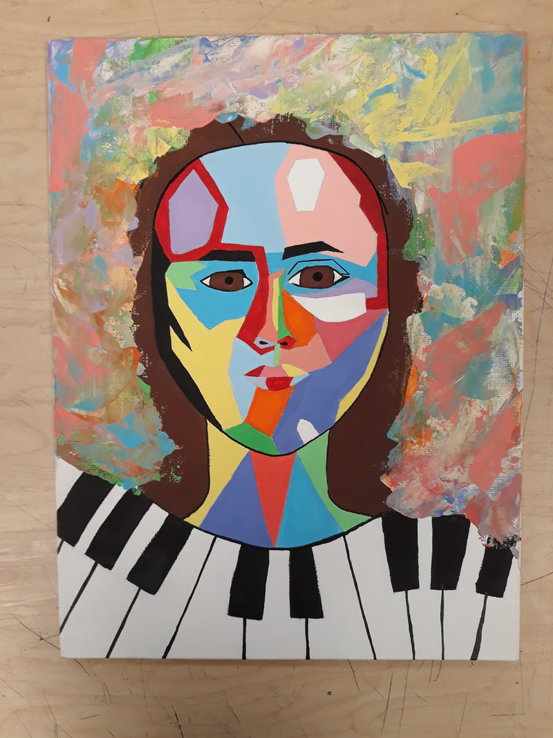 I didn't necessarily choose a specific face for this portrait, but I did add some on my facial features. I made the nose and the mouth a bit more similar to my own, just to make it a little more unique. The artist that inspired my work was Frida Kahlo. She inspired me because I like the way that she not only makes a portrait, but she creates an unknown story behind it as well. One thing that I borrowed as an idea for my art work was the scrape paint as the background, and also the different colors for the face. One thing that I find unique about my art work would be the way that I laid out all of the colors on the face, and the piano as well. Something I would say that I worked hard on, on this project again would be all the different colors, because it was difficult to get all of the colors even and enough layers of paint as well. Some things that I have learned or improved on while making this project would probably have to be just making a painting that is more precise. Because normally I just paint sunsets, or sketch simple things, but in this art work I had to think more outside the box. - This past year we got out of school early for summer because of covid. I was weird not being able to do anything but working for a while, but work kept me occupied for the most part. - Two goals that I have for this year are to learn more with acrylic and water color paints, because painting is one of my favorite things to do. - My favorite art material or art medium to use is acrylic paint. I find it very easy to use and to blend to make certain types of art that I like. - Some good memories from this past year of 2020 would definitely be when me and my friend Amanda went to Falls Park in Sioux Falls, SD. Otherwise this past summer was amazing and I met a lot of new people that also made it a summer to remember. - I'm not for sure what all I had missed out on because of covid-19, but I sure there were some fun projects in art that I missed. Or even some things that I might have needed for certain classes that I had missed out on as well. - One thing that I am looking forward to this semester is just learning new things and doing more projects. I hope that I will be able to use more acrylic paints because I really enjoy making art with it, but I am willing to learn other new things as well.
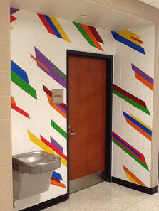
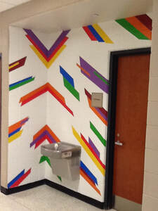
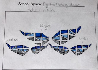
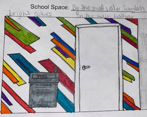
- The mural that I worked on was the mural by the water fountain. - The thing that I enjoyed most about making the murals was seeing how it all slowly started lining up and started to blend together and look good as the finished project. - The most challenging part of doing the murals was lining up all of the shapes in the design, because they all had to be a certain way in order to look even with each other. - My favorite job while doing this mural was taking off the tape, because I like to see how it all looks when it's all done. - I think that the effect that the murals will have on the school is that it will definitely lighten up or brighten the dull hallways and make them more exciting or creative. -
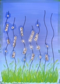
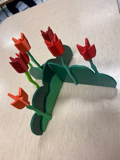
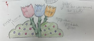 One thing that gave me the inspiration to make this sculpture or design was that I love tulips. They have always been my favorite flowers and I just like how they look and smell. A challenge that I kind of ran into while making this project was making some of the flowers. I had to be very careful to make sure that all fourteen pieces were all the same size and that they all fit together the way that I needed them to in order for them to look the way I wanted. I wasn't to sure on how to make the flowers at first.. But I decided just to wing it, and I actually really like how the final result turned out in the end. One thing that I really like about my project is probably the tulips and how they turned out. I wasn't really sure how they would turn out at first, but I glad that they look the way that they do as the finished product. One thing that I would do differently would be adding another layer of green spray paint on the main layer for the bushes. I had a few spots that I feel weren't covered as good as others, but they aren't to noticeable so I wasn't to greatly upset with it.
In the first picture the space that is being improved would be the wall to the left of the library door. In that space it is very bland and I believe that if there were to be something bright and creative there it would add that extra splash of color to another part of our school. During school events students, parents, and visitors will walk past this area, they will be able to take pictures with this mural as well, which I think many people will enjoy. The second mural would be added around the water fountain in the hallway with most of the classrooms. That area is very plain and could use some extra bright colors other than beige. Which is why I decided to make this design in this space. I think that this is a good space for this design because students walk past this area every day and teachers stand across the hall between classes and would always see it. I believe that both of these designs would add that extra color that our school needs to add a little more inspiration into each others days, rather than it being plain or blank.
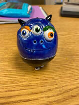
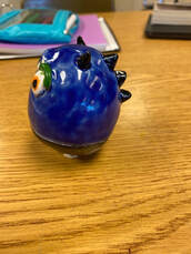
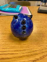
The way that this project shows imagination is because although some are cute, monsters are not real. I think that this project shows creativity and imagination is with the eyes. I really like how they turned out, and I like how each one is a different color. Another thing that I think is creative about this project is the spikes on the back and the horns on that top of the head, because it just gives my monster that extra character. One thing that I am please with about my project is with how the face turned out, because I wasn't expecting the mouth to show up under the glaze. One thing that I would say that I would do better with this project would be adding a layer or two of more glaze in certain spots to make the colors more precise and detailed. |